EchoKids • 2022
How I increased retention by 200% and created a 47% more effective dashboard
Overview
Redesigning the mentor dashboard to drive retention and streamline user flow
EchoKids is a NYC-based music education company that connects musicians as mentors with children aged 0–18 for private and group lessons.
As the only designer on this project, I reported directly to the CEO, co-defined the success metrics with her, and owned the mentor dashboard redesign end to end. I also proposed extending the project into a refreshed design system so the web app and marketing site finally matched. The redesign was implemented across EchoKids’ mobile and desktop platforms.
Impact: Weekly returning mentors grew from 15 to 45 in the 6 weeks after launch (+200%), and the time to find a tool on the dashboard dropped by 47%.
The Challenge
Mentors weren’t finding or using the tools EchoKids built for them. The menu was hidden, the dashboard had no clear hierarchy, and inconsistent buttons and colors made it hard to tell what was clickable.
How might we improve the user flow, organization, and visuals of the dashboard so mentors are aware of and actually want to use the tools EchoKids provides?
My Approach
I started with a heuristic evaluation, aligned with the CEO on goals and constraints, and interviewed mentors to find what they used most and what frustrated them.
From there, I iterated through three layouts, kept the parts mentors already valued, and built a design system and component foundation the developers could reuse across the product.
Discovery & Research
Gaining understanding through heuristics, stakeholders, and mentors
Heuristic Evaluation
My first step was a heuristic evaluation of the existing web app using 6 of Nielsen’s heuristics, which I presented to the team. The biggest issues: no visibility of system status (unclear if changes saved), no easy way to exit pop-ups, and inconsistent buttons and terminology across pages.
View Heuristic Evaluation Slide Deck
Aligning With the CEO
I met with Shizuno Furuya, CEO and founder of EchoKids, to align on her vision, define KPIs, and understand constraints. Three things came out of it:
Goal
Get mentors returning to the dashboard every week, not just when a lesson is scheduled.
Component Constraints
An example is the calendar was a third-party plugin that couldn’t be modified. The redesign had to work around it.
Brand Need
EchoKids needed a distinct, consistent identity across the web app and marketing site to stand out from competitors and establish its brand.
Key Performance Indicators (KPIs)
User Retention
The primary metric was to increase the number of mentors returning to the dashboard each week.
Pages Explored
Increase how often mentors navigate from the dashboard to secondary tools like earnings, roster, and files.
Time to Find a Tool
Reduce the time it takes a mentor to reach the tool they came for, so less time is spent hunting and more time preparing for lessons.
Mentor Interviews
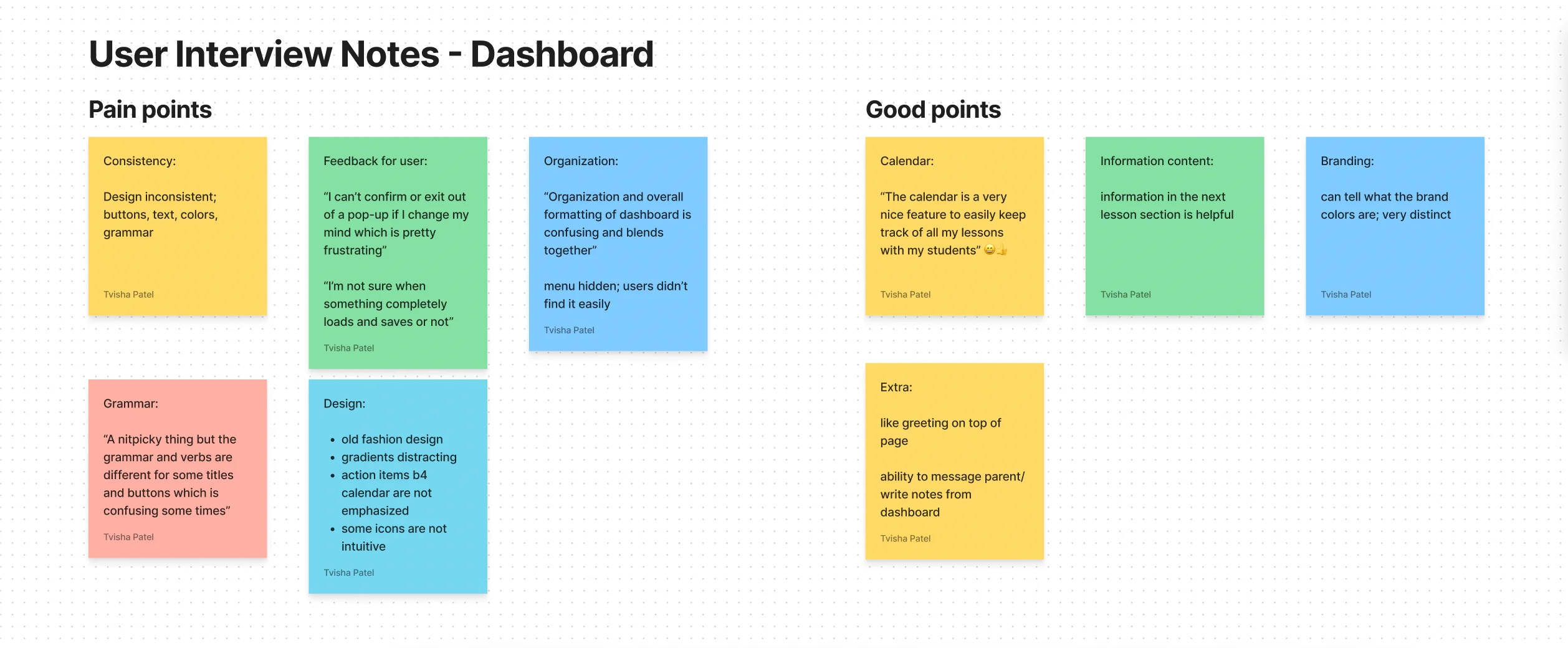
I interviewed 8 mentors across two cohorts: first-time mentors navigating EchoKids for the first time, and seasoned mentors with ongoing students. I captured both what frustrated them and what they didn’t want to lose.
User research: Hidden menus and unclear feedback confused mentors
What I Learned
Pain Points to Fix
- Hidden menu: mentors struggled to find navigation at all.
- No structure: “Organization and overall formatting of dashboard is confusing and blends together.”
- No exit: “I can’t confirm or exit out of a pop-up if I change my mind.”
- No feedback: “I’m not sure when something completely loads and saves or not.”
- Unclear icons and inconsistent button wording.
Things to Keep
- The calendar: “A very nice feature to easily keep track of all my lessons with my students.”
- Next lesson details at the top of the page.
- The greeting and the ability to message parents and write notes from the dashboard.
Constraints & Decisions
Deciding what to change, and what to leave alone
The Calendar Stayed
The calendar was a locked third-party plugin, and mentors called it the most useful part of the dashboard. Instead of fighting it, I designed the new layout around it and used the space beside it for a dedicated Action Items panel.
Discoverability Over Screen Space
A new persistent sidebar would cost horizontal space, but mentors couldn’t find the old hidden menu at all. I chose discoverability, and recovered the lost space by moving important sections to the dashboard inself to be more accessbile.
New Design System With the Redesign
A brand refresh wasn’t part of the original scope but I pitched doing it together with the dashboard so the developers would only have to rebuild the UI once, with modern and consistent colors, type, and components.
Before & After
Transforming navigation and introducing modular compartments
Shift: Hidden navigation → Persistent sidebar with modular cards
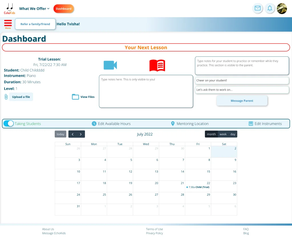
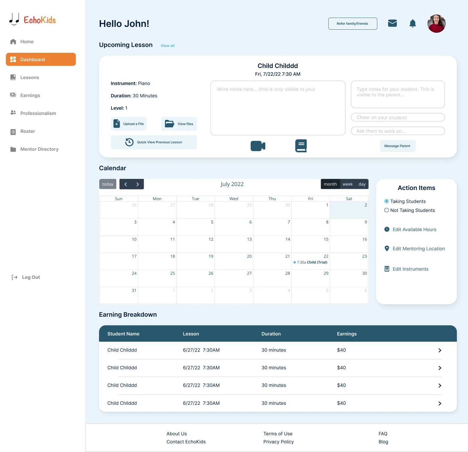
Static Sidebar Navigation
Replaced the hidden hamburger menu with a persistent sidebar that puts the most-used destinations front and center.
Structural Compartments
Split the page into distinct, headed sections (Upcoming Lesson, Calendar, Action Items, Earning Breakdown) so mentors can scan for what they need instead of having to read everything.
Disciplined Color
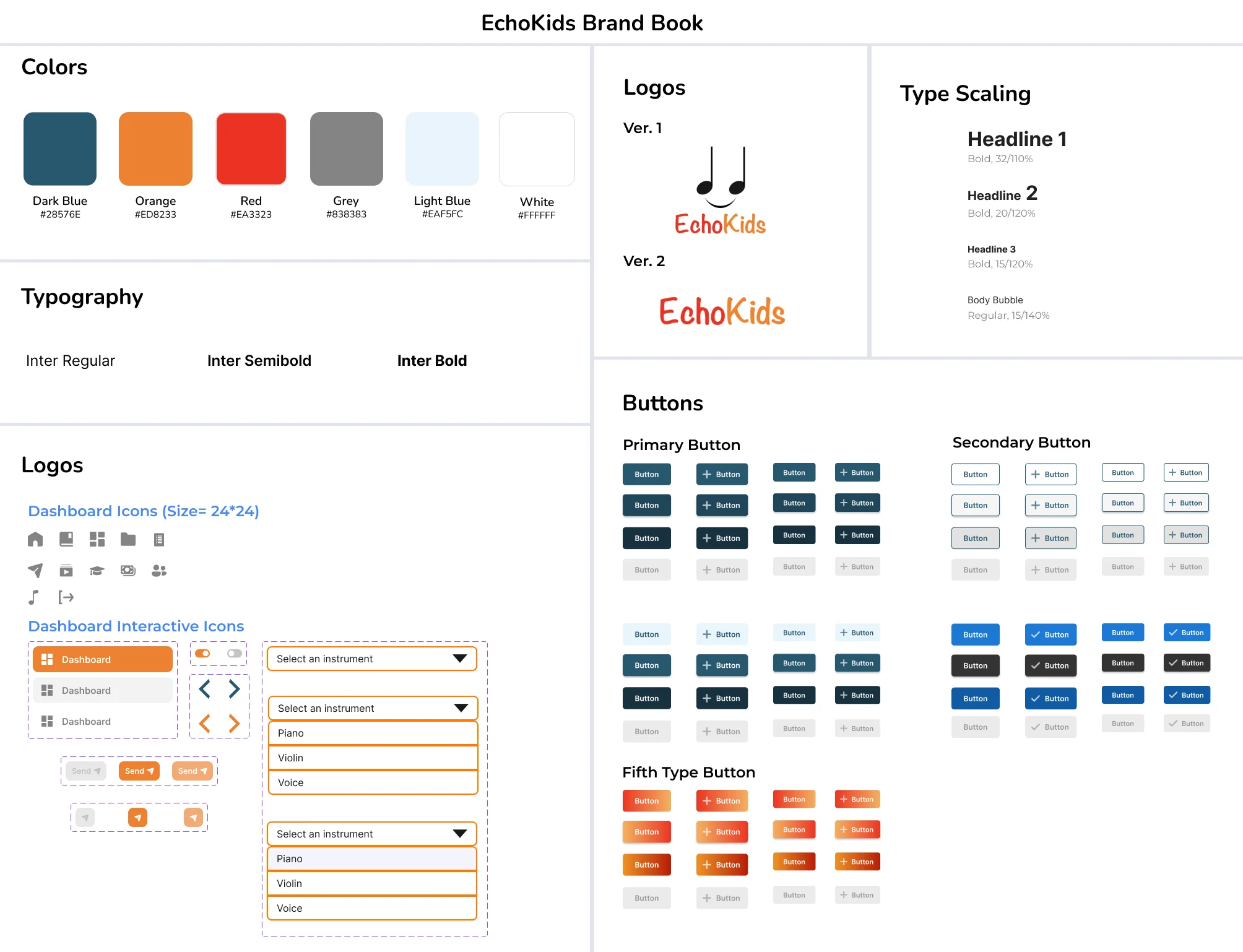
Restricted the palette so color signals meaning: orange for the active navigation tab, dark blue for CTAs, white section cards on a light blue background.
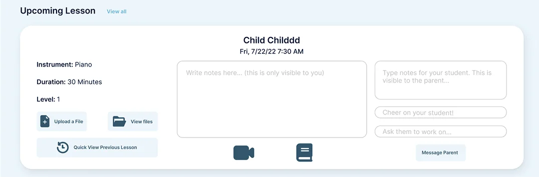
Closer Look at the Upcoming Lesson Card
Component zoom: Added explicit headers and instant save feedback
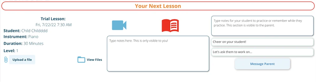
Adding Headers
Mentors struggled to see where each section started and ended. Explicit headings mark clear zones and make the dashboard far more scannable.
Information Order
Student name and lesson date moved to the top center for quick scanning. I added a “Quick View Previous Lesson” button that mentors asked for in interviews, so they can review past notes without leaving the page.
Clear Interaction Feedback
Notes fields now show a “Saved” confirmation, and every pop-up has a visible Cancel and close button, addressing the two feedback issues mentors raised.
Design Iterations
Iterating through dashboard layouts (V1 to V3)
Version 1
Tried: Grouped lesson data into cards and kept a top navigation bar. Learned: Navigation was accessible and there was room for quick links, but without icons the layout read more like a marketing homepage than a tool.
V1 layout: Top navigation without icons read like a landing page
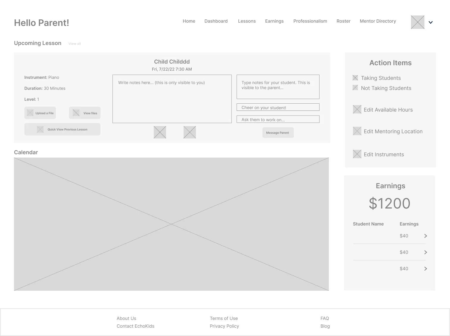
- lack of icons in navigation, designed more like a home page
- navigation easily accessible
- space to add more information/quick links on the side
Version 2
Tried: Altered card proportions and integrated quick actions. Learned: Navigation became harder to reach as a hamburger menu, and the layout left too much empty space in the top left.
V2 layout: Hamburger menu created friction and awkward whitespace
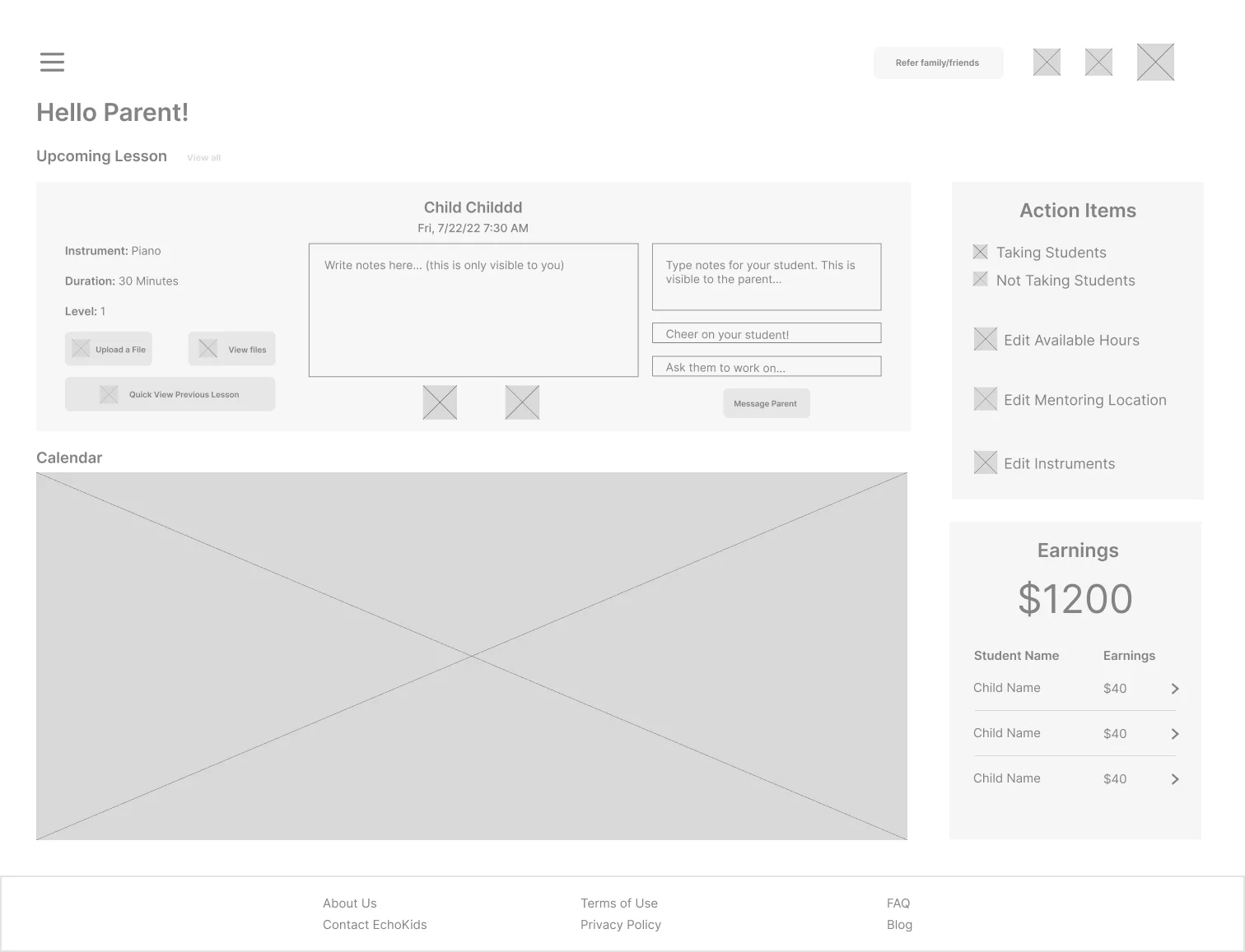
- navigation not easily or quickly accessible
- too much white space on the top left of screen
- space to add more information/quick links on the side
Version 3
Tried: A dedicated vertical sidebar. Learned: Navigation was finally fast to reach and the top of the page was used well, but the narrower content area left less room for quick links and information.
V3 layout: Persistent vertical sidebar fixed discoverability
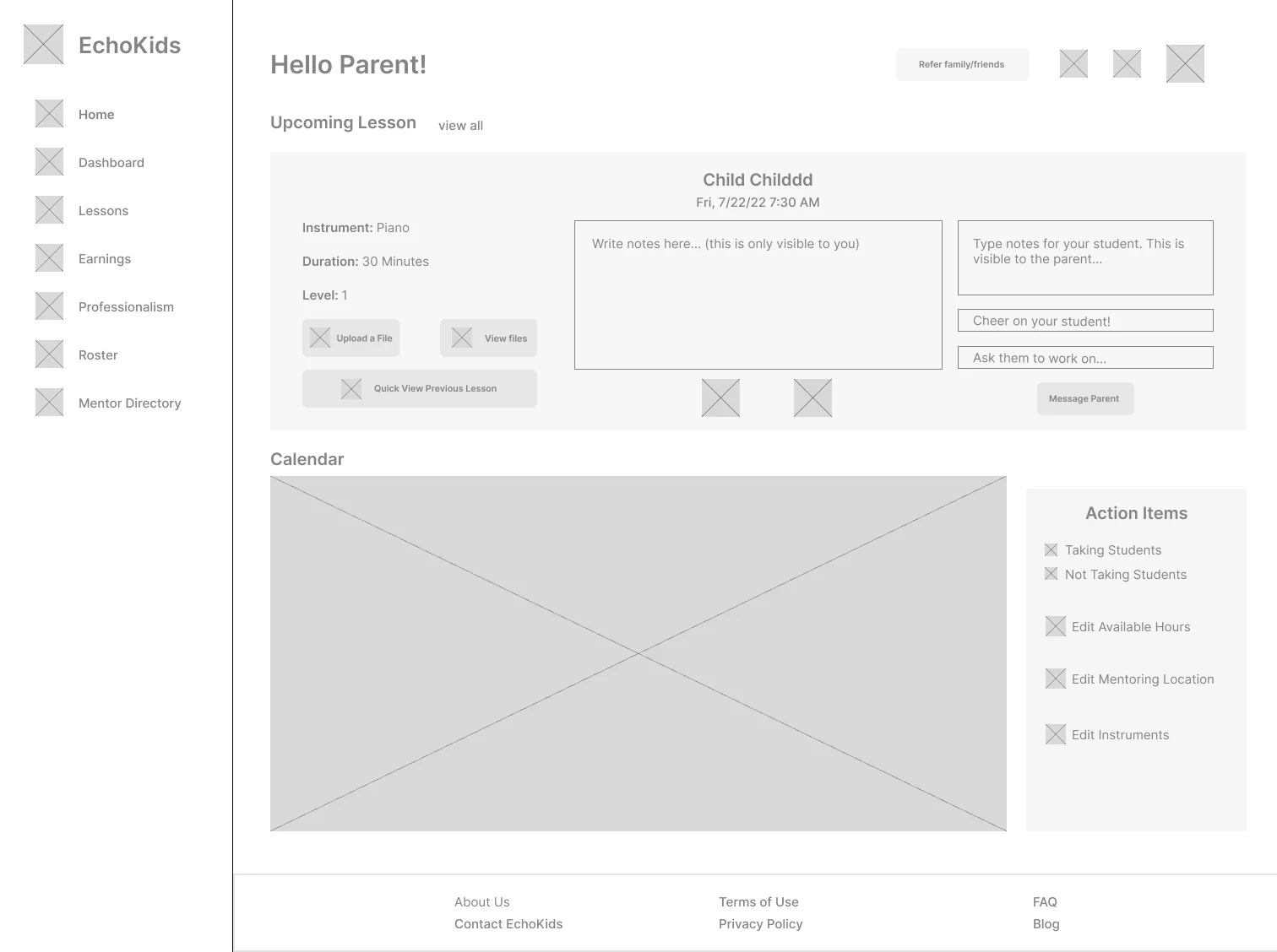
- less information/quick links present on the screen
- navigation very easily/quickly accessible
- effective usage of space on the top of the dashboard; appropriate for the navigation to take up this much space since it will be used often and quickly
Final Wireframe
I committed to V3’s sidebar and solved its one drawback by adding an Earning Breakdown section at the bottom of the page, bringing back the information that the narrower page space had pushed out.
Final wireframe: Added earnings breakdown to reclaim lost page width
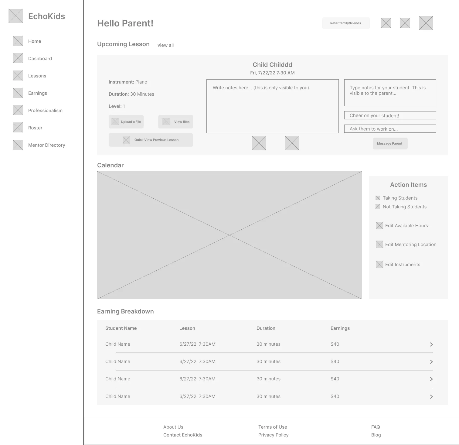
- added breakdown section at bottom of page to solve lack of information drawback
- navigation very easily/quickly accessible
- effective usage of space on the top of the dashboard; appropriate for the navigation to take up this much space since it will be used often and quickly
Final UI & Brand
Establishing the design system and delivering high-fidelity screens
Design System
I built a refreshed design system covering color, typography, and core components to give EchoKids a consistent identity across every digital touchpoint.
Design system: High-contrast color hierarchy, type, and components
Final Dashboard
Applying the brand system to the final wireframe produced the production-ready interface.
Shipped dashboard: 200% retention boost with scannable mentor hubs
Explore the Prototype
Explore with the embedded Figma prototype below to test the navigation flow, compartment structure, and mentor lesson views.
Impact & Outcomes
Measurable results shipped across mobile and desktop
Measured over the 6 weeks following production launch across EchoKids' mentor community:
+200%
Weekly Returning Mentors
Active weekly mentor engagement grew from 15 to 45 mentors.
-47%
Time to Find a Tool
Drastic drop in navigation friction thanks to the persistent sidebar.
0→1
Design System Shipped
Unified brand refresh and reusable component library adopted across app and web.
Reflection
Key takeaways & lessons learned
1. Owning the Whole Problem
As the only designer, there was no one to hand decisions off to. I learned to set my own direction, from the research plan to the design system pitch, and defend it to the CEO with evidence.
2. Knowing What Not to Change
The calendar constraint taught me that a redesign isn’t about changing everything. Keeping what mentors already valued and working around technical contraints let me focus effort where it mattered.
3. Shipping to Real Users
This was my first project shipped to production. Seeing weekly returning mentors triple, and hearing mentors say the dashboard finally made sense, showed me how design can truly impact people’s daily work.