BetterHelp • 2023
Simplifying technical complexity for clients and therapists | 33% more streamlined flow
Overview
Simplifying pre-call device testing for over 5 million clients and therapists
BetterHelp is the largest online therapy platform with over 5 million users. During my internship, I redesigned the video session test: the page clients and therapists use to check their camera, microphone, speaker, and connection minutes before a live session.
I owned the redesign from audit to final UI. My senior designer reviewed my work weekly, and I partnered directly with engineering, data, and our UX writer. The redesign shipped to production in October 2023.
Impact: Cut the device test from 4 sequential pages to a single tabbed page, reducing the clicks needed to complete a full test by 33%, so users can check only what’s broken right before a session.
The Problem
Users open this page minutes before a therapy session, often already anxious. The old test forced them through camera → microphone → speaker → network in a fixed order. Someone with only a network issue had to click through three unrelated steps to reach it.
Data showed that ~40% of visits were repeat visits within 10 minutes of a scheduled session, a sign users were getting stuck or frustrated and retrying.
The Goal
How might we redesign the video session test so users can fix the one thing that’s broken quickly, with full control over the process?
My approach: replace the rigid sequence with a single page where any device can be tested in any order, and rewrite the troubleshooting help so it reflects today’s browsers and apps.
Before & After
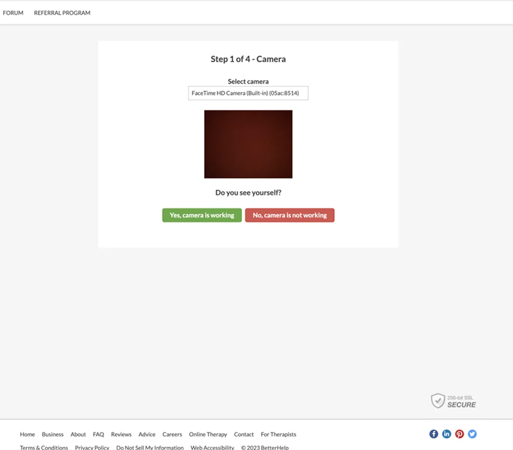
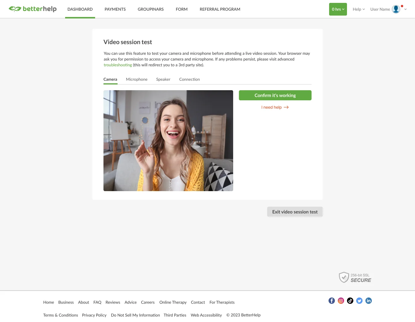
From a 4-step sequence to one flexible page
The two biggest shifts: the test structure, and the help experience that appears when something goes wrong.
Shift: 4 sequential pages → 1 flexible tabbed test
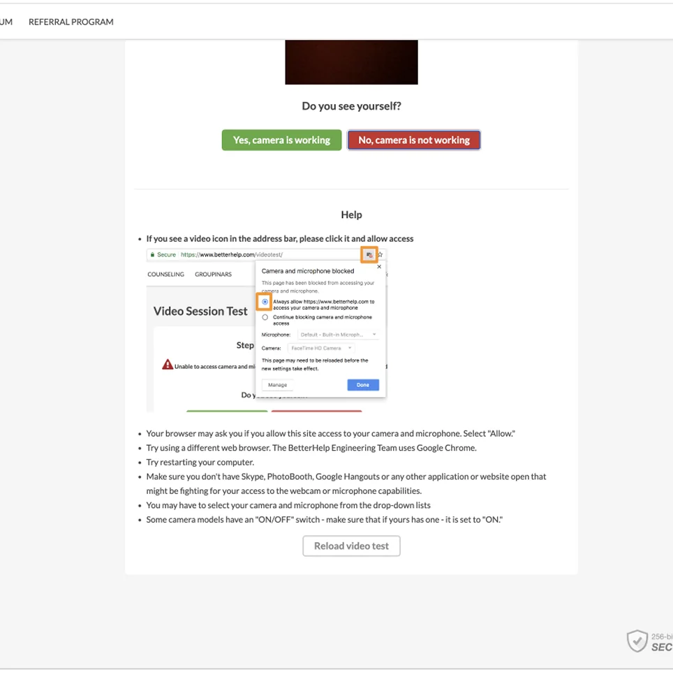
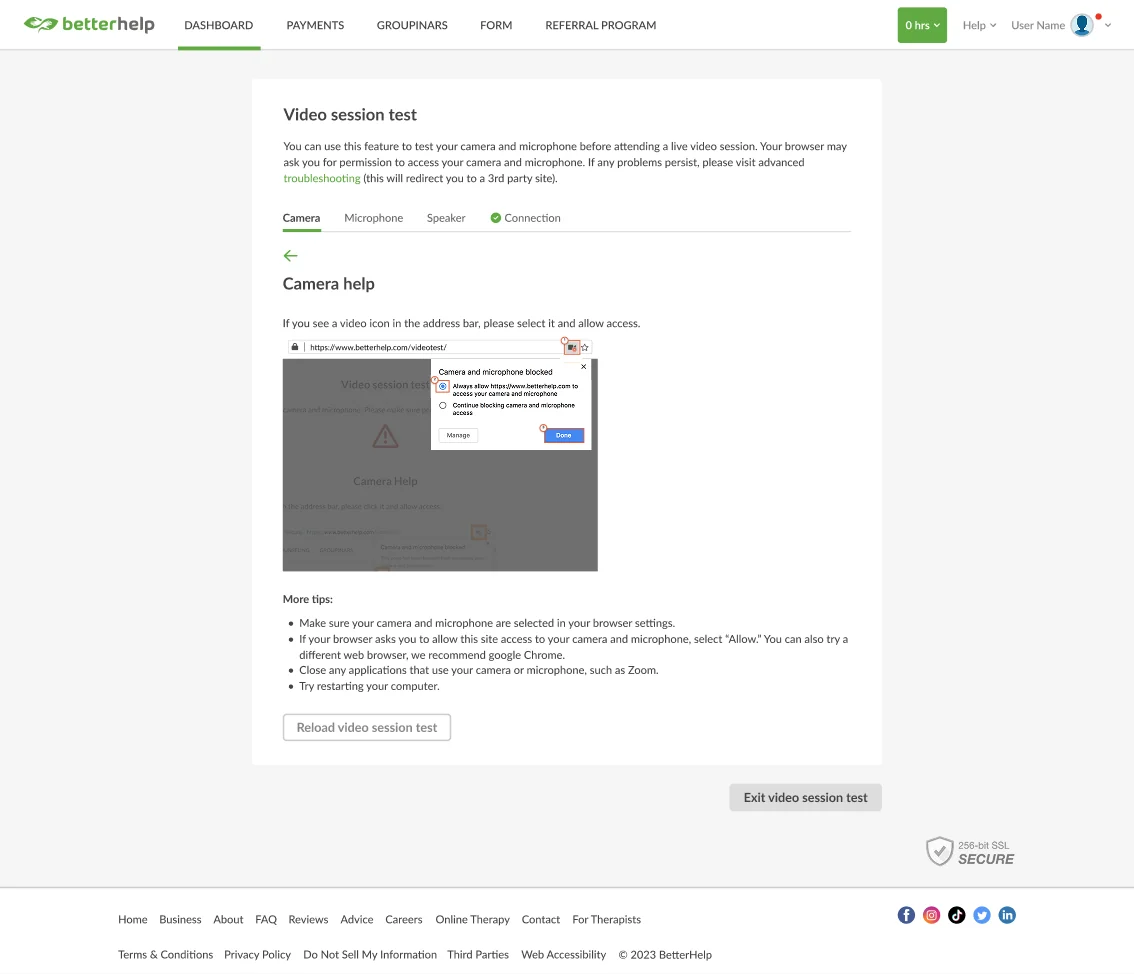
Redesign: Replaced outdated text with targeted slide-in help
Structure
Replaced the sequential steps with tabs, so users jump straight to the device they need. Added an “Exit video session test” action at every stage so no one feels trapped.
Help Experience
Moved help into a dedicated slide-in view that encourages users to reload after changing settings. I worked with our UX writer to cut outdated references (Skype, PhotoBooth, Google Hangouts) and visually highlight exact browser permission settings.
Visual Consistency
Adopted BetterHelp’s standard buttons, typography, colors, and left-aligned hierarchy so the feature feels native to the rest of the product.
Discovery & Research
Gaining understanding across engineering, data, and competitors
I went directly to the teams who owned each piece of the problem:
Engineering
Met with the video session developers early to understand browser permission limits and what was realistic to build in one sprint.
Data
Pulled traffic, repeat-visit, and drop-off data from the data team. The biggest drop-off happened at step 2 (microphone), and most repeat visits came within 10 minutes of a session.
Users
We didn’t have bandwidth for formal usability testing within the sprint, so I reviewed recent support tickets about audio/video issues to understand what was actually breaking for users.
Insights from the Previous Design
Legacy state: One device per page in rigid sequence
Legacy state: Dense text with outdated app references
Competitive Analysis
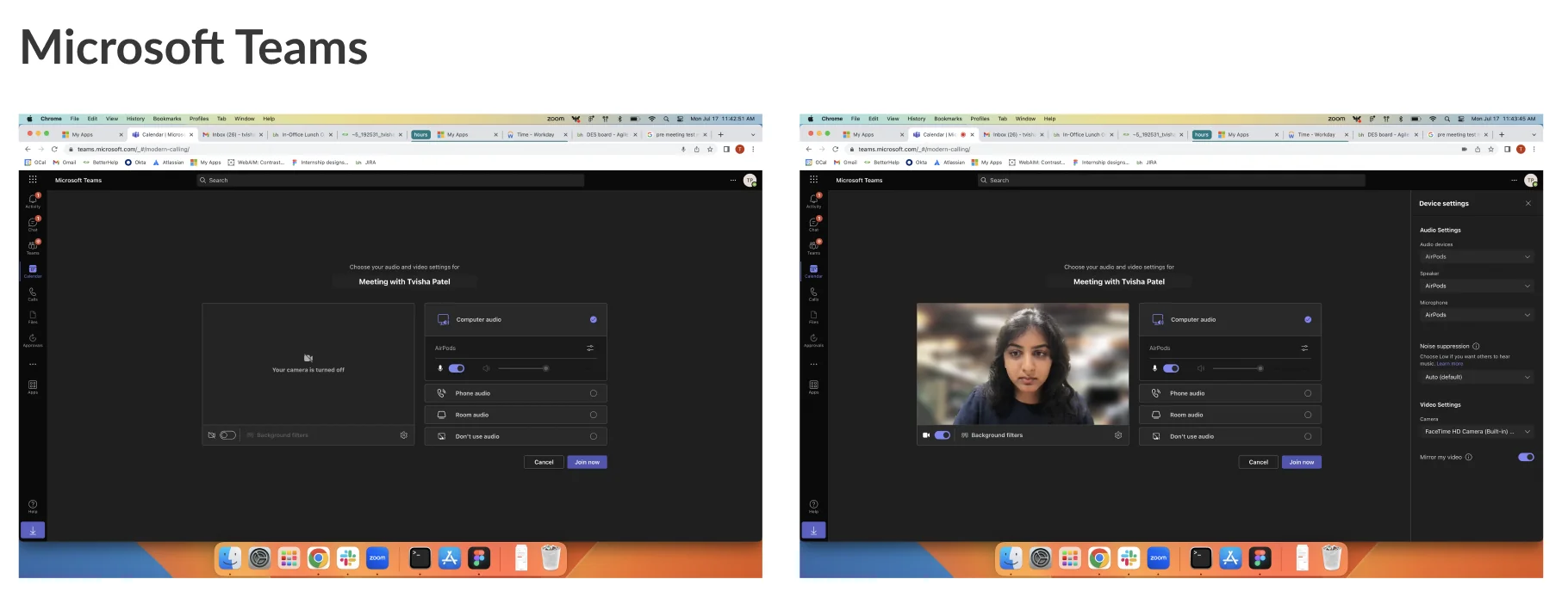
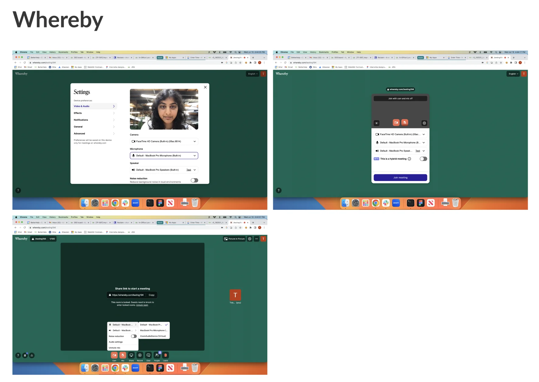
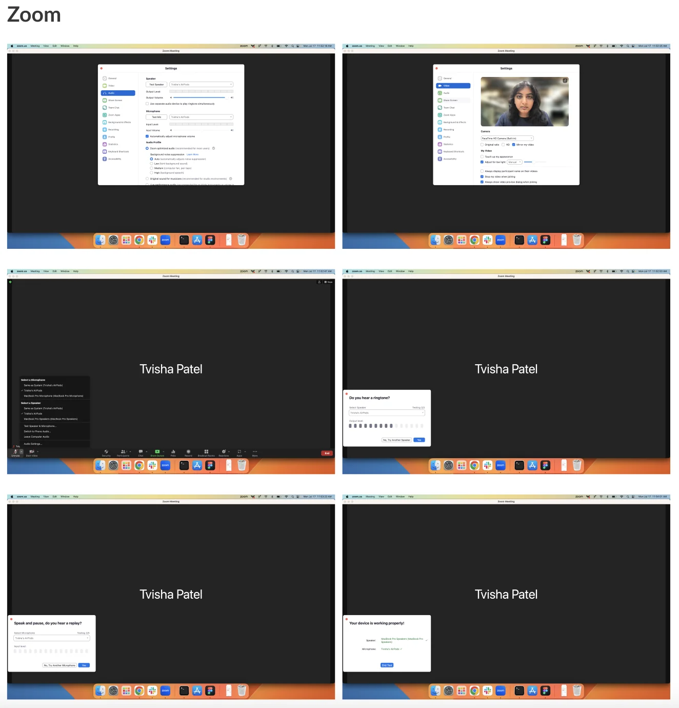
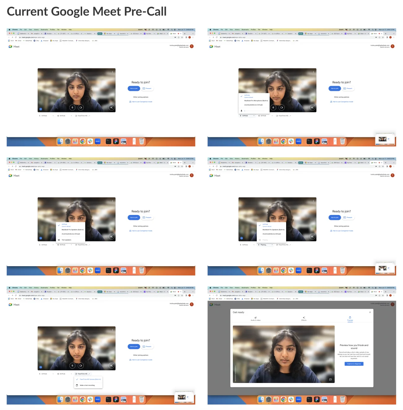
I audited pre-call checks across Microsoft Teams, Whereby, Zoom, and Google Meet. Here’s what shaped the design:
Teams audit: Single pre-join screen with all devices visible
Whereby audit: Compact card keeps user on the same page
Zoom audit: Clear yes/no prompts, but locked order
Meet audit: Self-service preview with quick device toggles
Design Iterations
Testing three layouts
Version 1
Tried: A single preview window with device dropdown pills underneath and instructions tucked into a tooltip. Learned: It gave users control over what to test, but hiding the instructions made them too easy to miss. Dropped because: Dynamic device dropdowns were high dev lift to build, and the important copy was too hidden in a tooltip.
V1 exploration: Dynamic pills with instructions in a tooltip
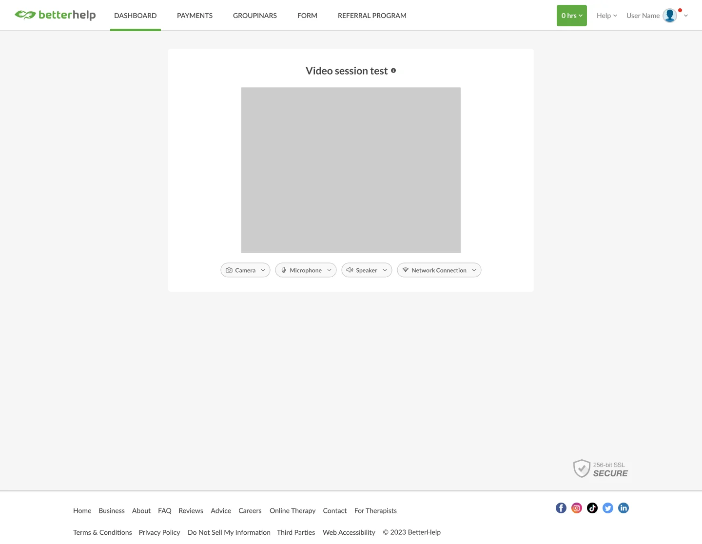
- technically difficult/consuming to have dynamic drop downs
- give user more agency to chose what device to test
- less writing on page with copy within a tool tip; however copy is too hidden now
Version 2
Tried: Equal-sized device tiles acting as dropdowns, with instructions visible on the page. Learned: Visible instructions can fit without crowding the layout. Dropped because: It still relied on dynamic dropdowns which was too high of a dev lift.
V2 exploration: Equal-sized tiles with visible instructions
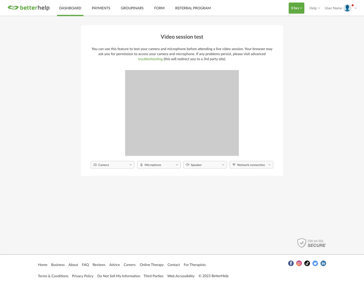
- technically difficult/consuming to have dynamic drop downs
- instructions does not take up too much space and visible
- give user more agency to chose what device to test
- cleaner design with equal sized squares as drop downs
The Tradeoff: Dynamic Dropdowns vs. Shipping This Sprint
V1 and V2 both depended on dynamic dropdowns with real-time feedback meters (like a live microphone soundwave). When engineering flagged these as too costly for the sprint, I pushed for V3’s simpler tab structure instead.
What we gave up: real-time audio feedback. How I adjusted: each tab has a clear “Confirm it’s working” / “I need help” choice, and the step pages have clear feedback on if their device is working (camera view, microphone playback, speaker sound play, network auto-check).
Version 3
Tried: Tab navigation across Camera, Microphone, Speaker, and Connection, with simple confirm/help actions. Kept because: It was cheap to build, preserved user choice over what to test, and left instructions visible.
V3 wireframe: Fast tabbed navigation with low engineering lift
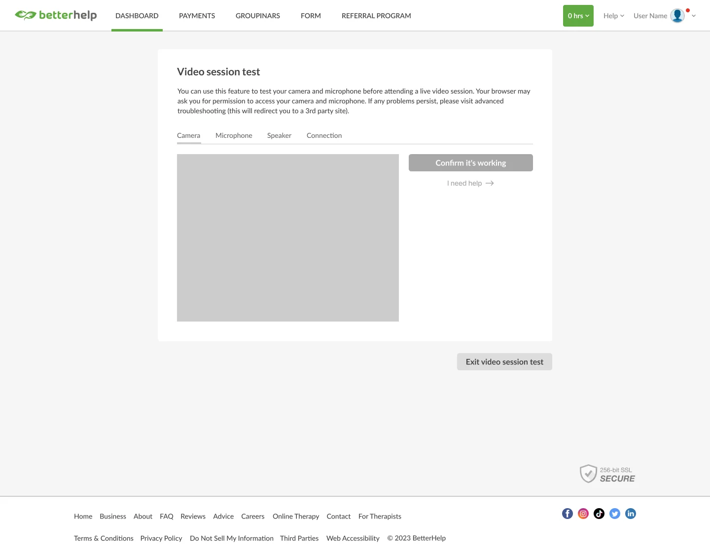
- technically efficient and less dev effort
- give user more agency to chose what device to test
- clean and modern design with visible instructions
Final UI & Prototype
Applying BetterHelp’s brand to the final design
Applying official brand typography, colors, button styles, and elevation guidelines to the V3 wireframe produced the final and modernized interface.
Approved wireframe: Validated tab structure ready for UI
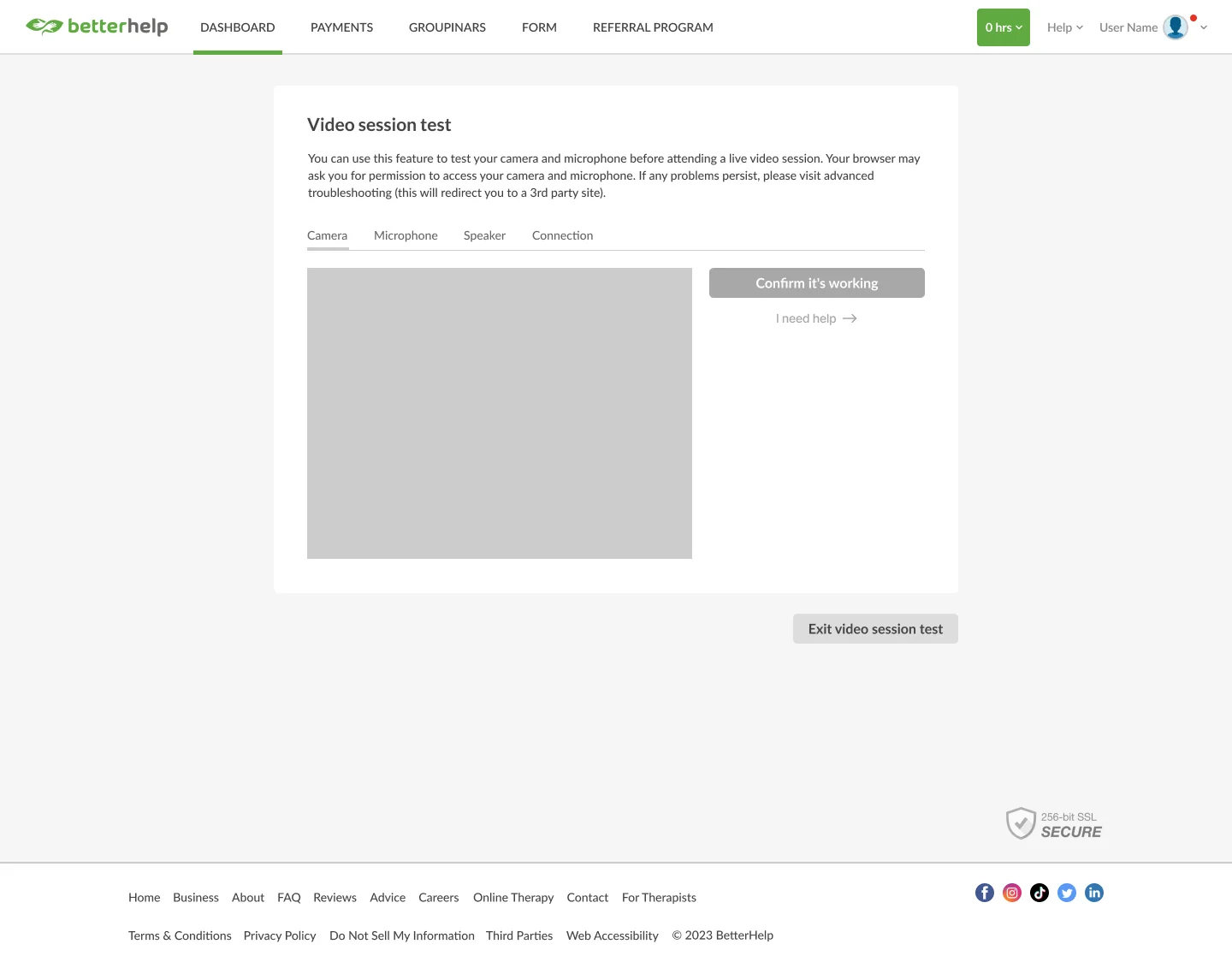
Production UI: Built with BetterHelp brand guidelines & elevation
Explore the Prototype
Explore the embedded Figma prototype below to test the device tabs, camera and microphone flows, and troubleshooting states.
Impact & Outcomes
Measurable results shipped to 5 million users
Shipped to production across BetterHelp’s web platform in October 2023, delivering immediate improvements to pre-session confidence:
-33%
Test Time & Clicks
Reduced full flow from 4 sequential pages to one streamlined, tabbed surface.
5M+
Clients & Therapists
Scalable device testing experience supporting millions of therapy sessions.
1-Click
Direct Diagnostics
Jump straight to specific broken hardware without clicking through unrelated tests.
Reflection
Key takeaways & lessons learned
1. Going Beyond the Brief
I introduced Jitter to the design team to create more detailed animation and interaction handoffs, which other designers adopted for their own projects.
2. Designing Within Constraints
Losing dynamic dropdowns caused a big pivot, but it forced a better question: what’s the simplest signal that tells a user “you’re good to go”? Finding that answer, rather than fighting the constraint to follow familiar standards, is what got V3 shipped.
3. Speed With Craft
I juggled multiple design projects tracked in JIRA for sprint reviews, and leaned on cross-functional collaborators and the growing design system at BetterHelp to move fast without sacrificing quality.